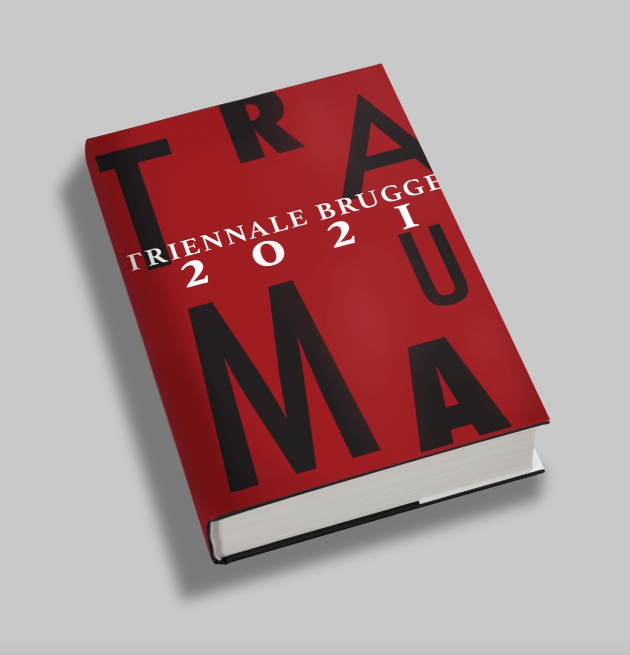

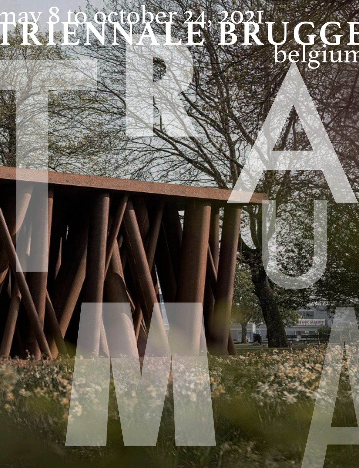
Triennale Brugge 2021: TRAUMA
Within this project I was tasked with creating a fresh brand profile. I formulated strategic brand decisions, drawing inspiration from the conference description’s and examining published images of the featured artworks.
APPLICATIONS USED:
Adobe Illustrator | InDesign | Photoshop
Brand development
First I wanted to develop a brand kit that would provide structure and cohesion between designs, but allowed for flexibility and versatility within each project. I chose a deep maroon, black, an d white for the colors to represent the triennial’s theme of bold yet “hidden in plain sight”. For the typeface, I chose Futura for its diversity of striking sans-serif fonts avalible in everything from the condensed medium to the thick bold.


PROMOTIONAL POSTERS
I was then challenged to design posters to be used around Brugge, Belgium in order to advertise and develop interest in the upcoming triennial. I wanted the the text to overlay the conference images and expose the Trauma present within the surrounding environments.


Film screening
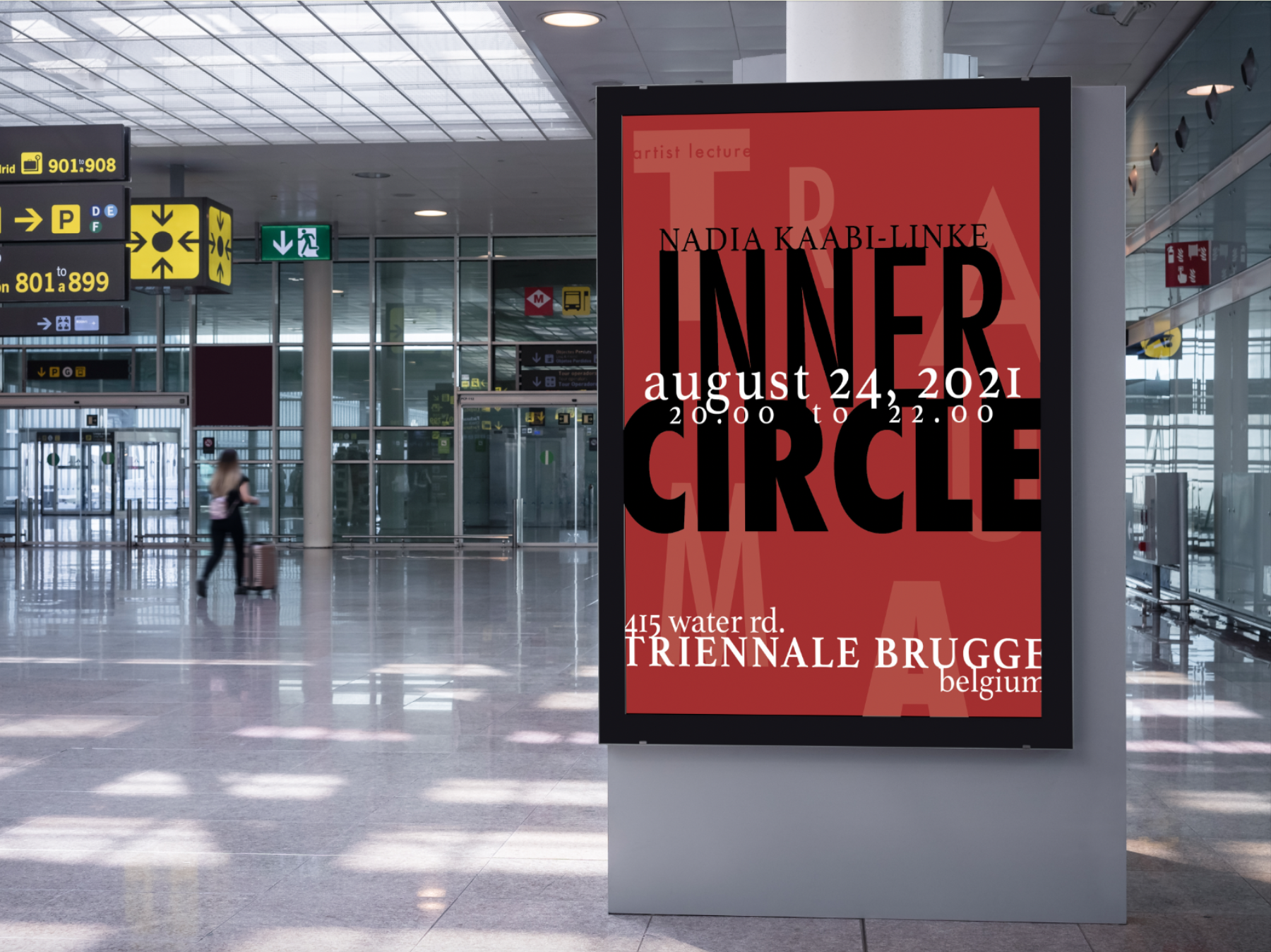
Artist Lecture
Publication
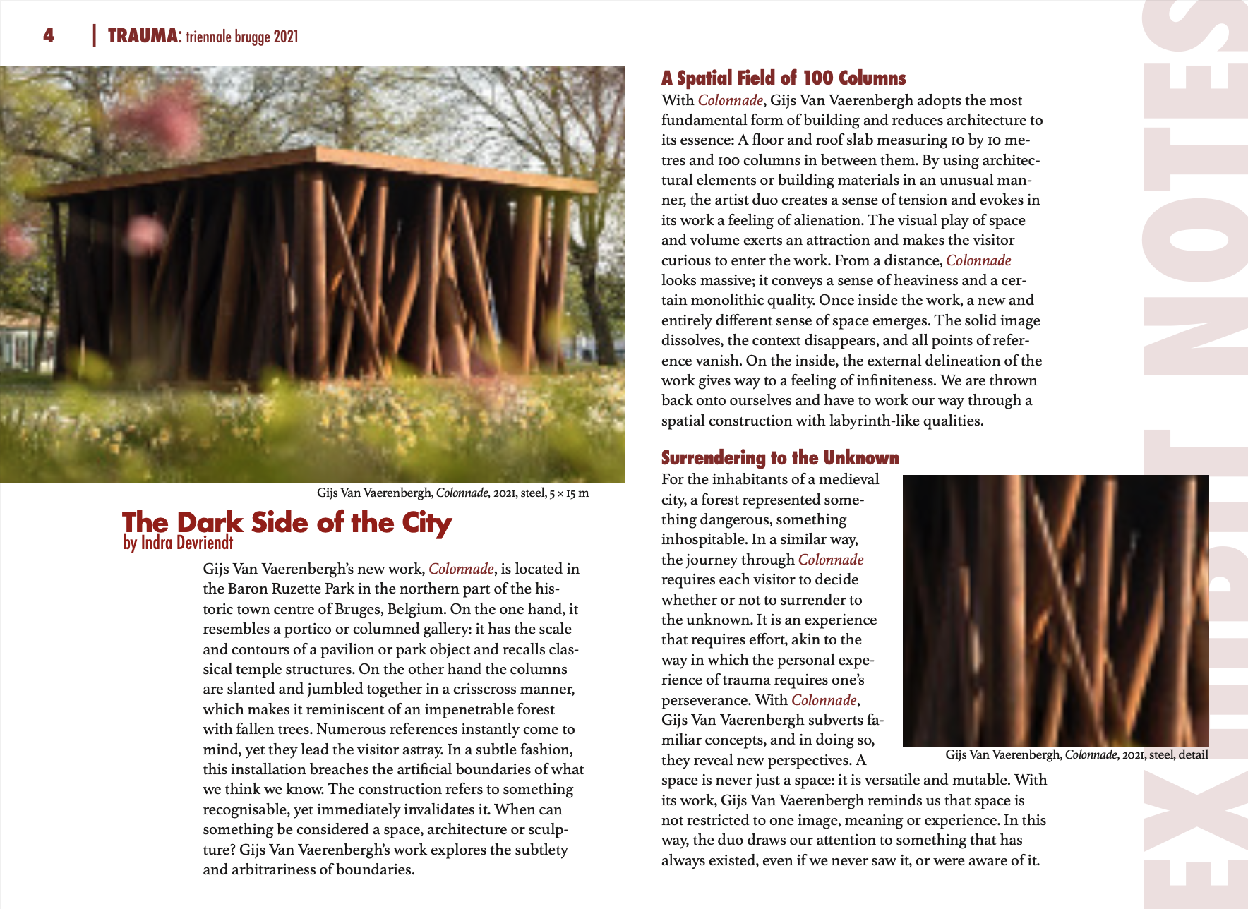
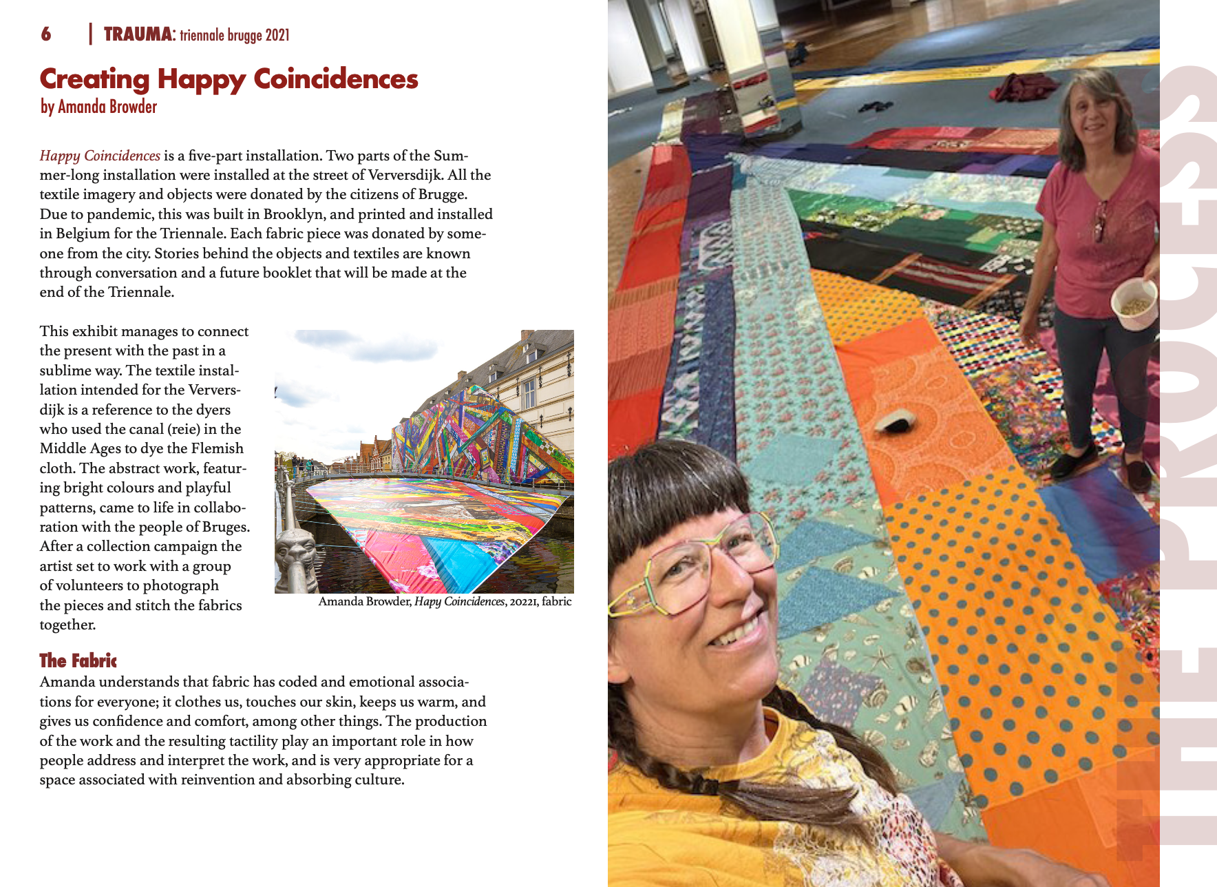
This project entailed developing a mock publication that featured all previously established brand design elements. This project would hypothetically serve as the template for the upcoming "2021 Triennial Brugge: Trauma" book which would include artist bios, exhibition critiques, as well as an added “scrapbook” section.