

UX/UI Case Study: Kung Fu Tea
During the COVID-19 pandemic, KFT relied heavily on its mobile and desktop ordering sites to keep their sales up. But both the mobile and desktop apps were in desperate need of a redesign which is where I stepped in as someone who loves KFT.
APPLICATIONS USED:
Figma, Adobe Illustrator
CHALLENGE
My primary goal in this redesign was to streamline the Kung Fu Tea ordering process to better fit the needs of current and potential users. The existing platforms’ surplus of elements led to confusion during user testing, decreasing efficiency.
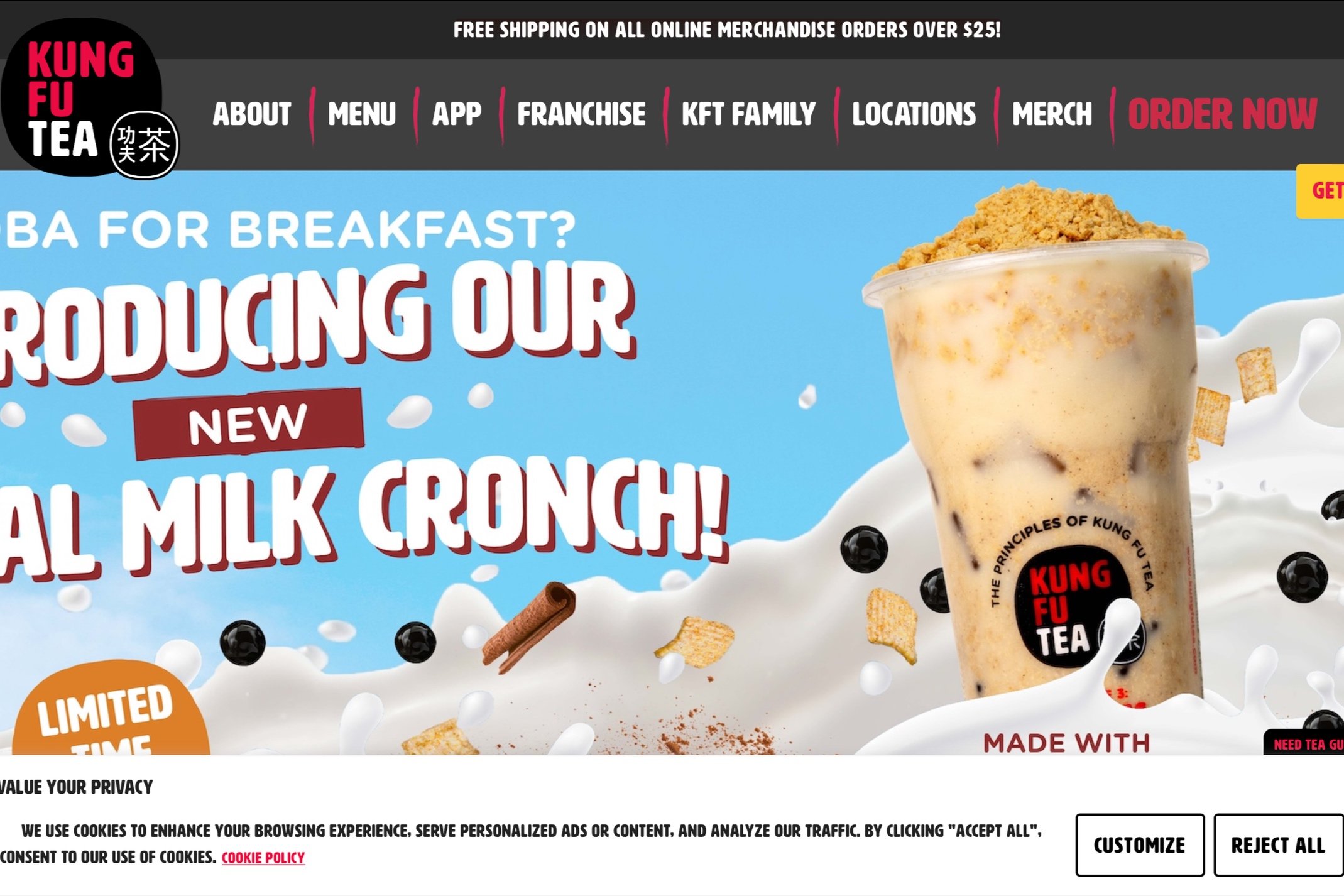
Old design

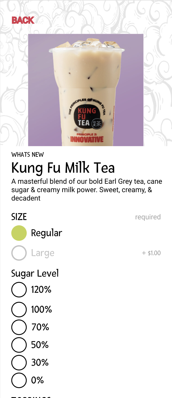
New design
SOLUTION
Analysis of the user journey
Led to the removal of extraneous steps and outdated information
Streamlined interface to prioritize essential elements
Mitigated user confusion and improving overall efficiency.
Redefined order flow to create a more intuitive experience
Enhanced user navigation and minimized potential points of friction.

APPROACH
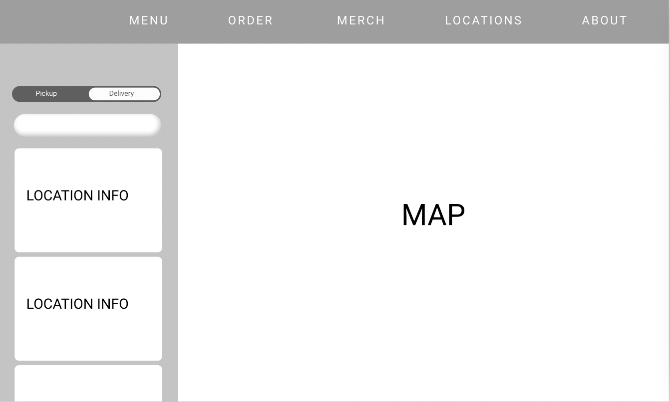
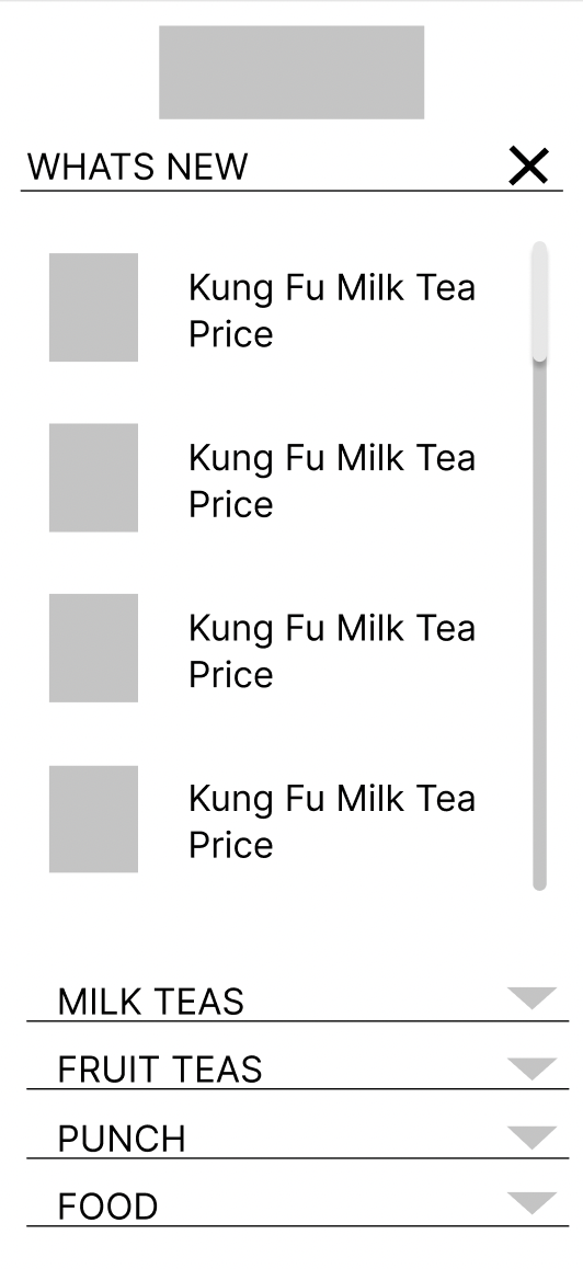
Initially, I created wireframes to assess and establish overall design directions. This process aimed to organize content blocks to ensure clarity and solidify the overall structural framework of the website.


DESIGN DECISIONs
The existing interfaces were simplified and the color scheme was adjusted to create a unified experience between mobile and desktop. In terms of typography, Fresca was added to align with the predefined branding aesthetics while adding a touch of modernity and uniqueness to the story of Kung Fu Tea.
