Triennale Brugge:
TRAUMA
a branding redesign
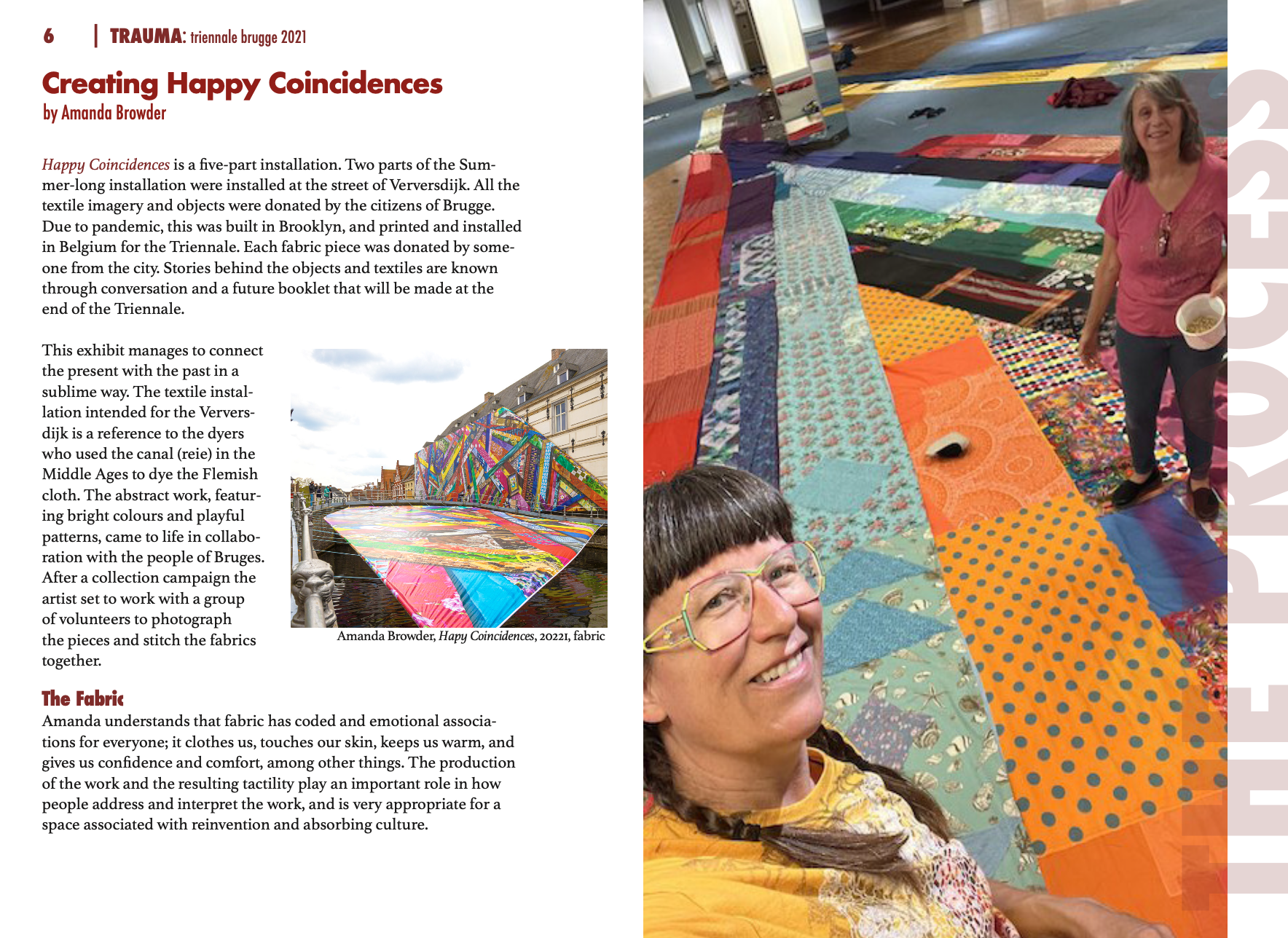
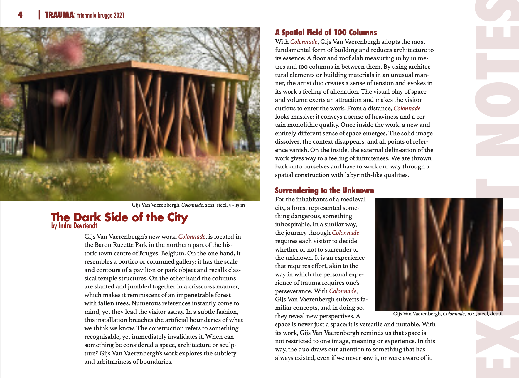
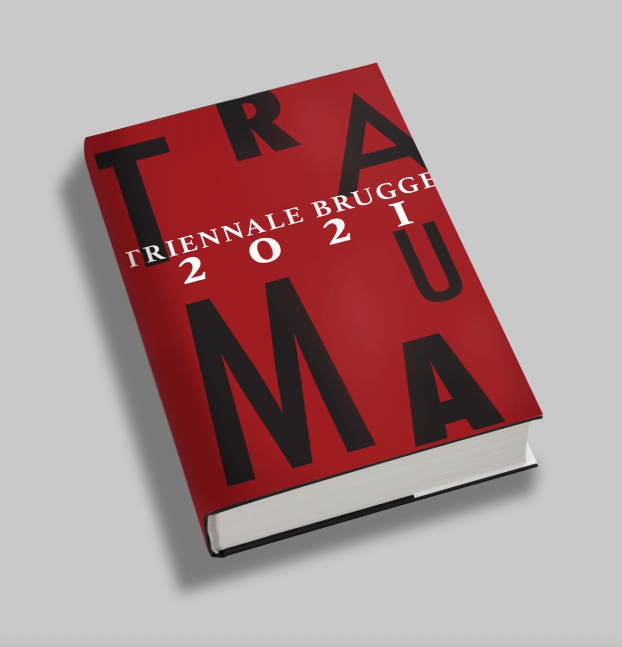
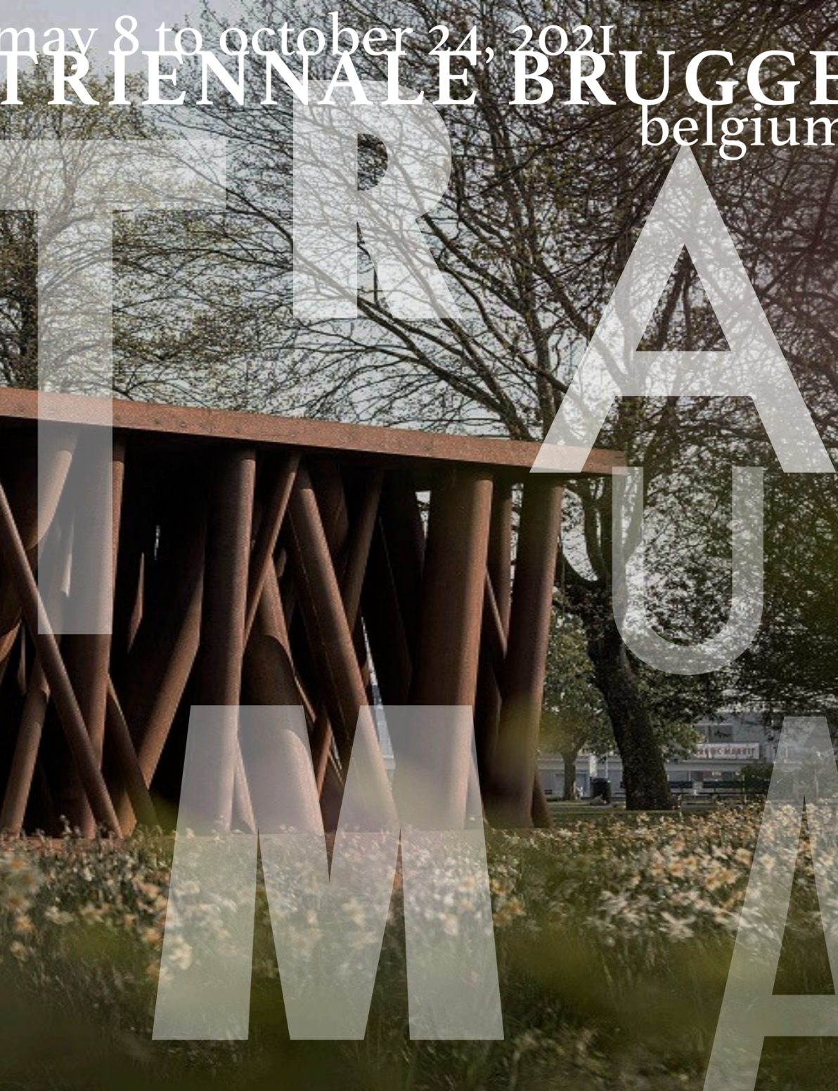
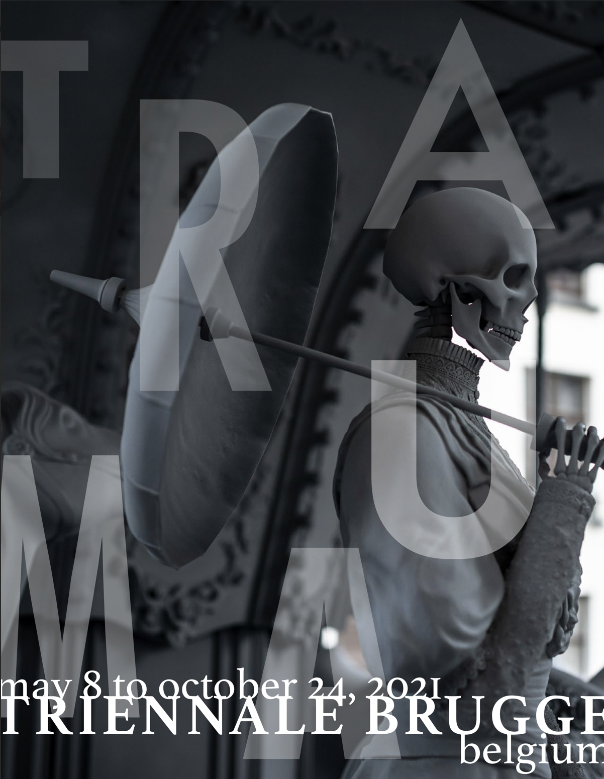
This was one of the first projects that made me fall in love with design. I was tasked with rebranding the iconic 2021 Triennale Brugge:TRAUMA. After creating a brand kit, I explored the creative use of each aspect in various settings from promotional items to a publication documenting the work that was presented and exhibited.
Tags: Branding, Graphic Design, Typography
Brand Development
I wanted to develop a brand kit that would provide structure and cohesion between designs yet allow for flexibility and versatility. I selected deep maroon, white, and black as the primary brand colors to highlight the theme of "bold trauma hidden in plain sight”. I then chose Futura for its variety of striking sans-serif fonts.


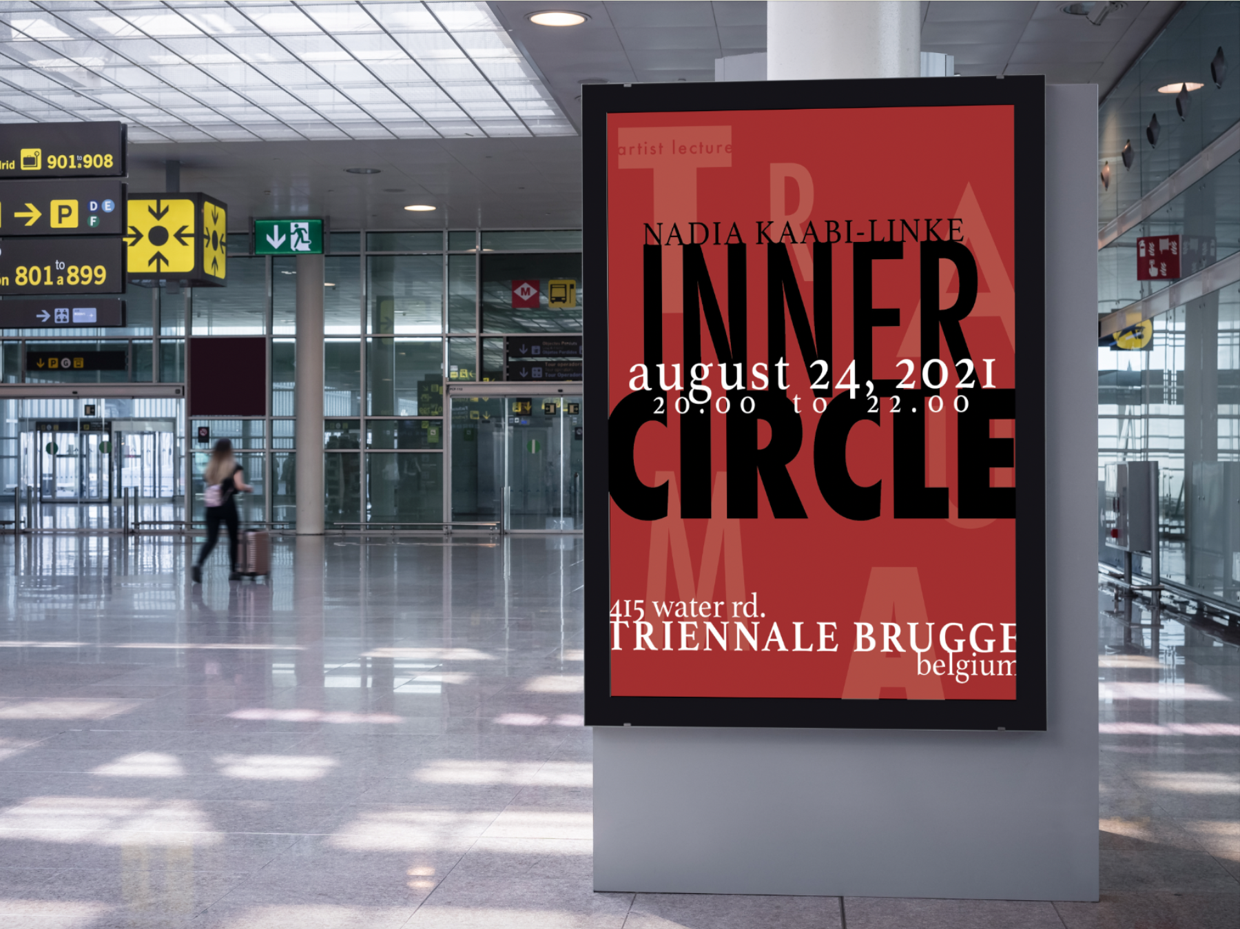
Artist Lecture

Film Screening
Publication

